Content Designer / IA Lead
Digging Out the Docs: From Information Archaeology to Architecture
Information architecture in complex product ecosystems usually starts with information archaeology. I dug through the doc landscape, created taxonomies, built the IA tree, and authored the style sheet that systematized documentation across the enterprise.
Delivered
114
live pages on fluent2.microsoft.design
83 of them components
Carried forward
re-encoded
as the machine-readable contract
Enables
5
platforms held to
one structure
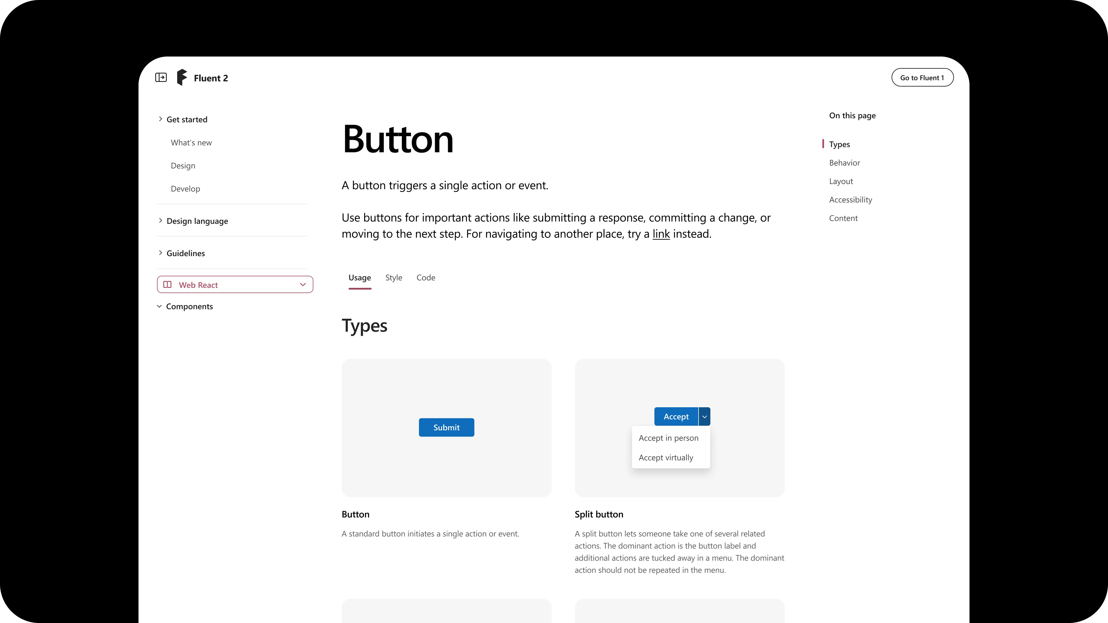
Built the IA from information archaeology. Dug the doc landscape, named the two kinds of component content, and settled it into a 3-tab tree (Usage, Style, Implementation) with a 5-section Usage taxonomy.
The slot structure became Fluent’s AI schema. The same shape, re-encoded, is how the system now exposes itself to models.
One canonical place for component truth, predictable from platform to platform.
Authored the paired style sheet that made the IA fillable: a written authoring guide plus a Figma template, so anyone could produce a structured page.
It gave the d11n suite something to write into. LydAI and the documentation skills generate against this structure rather than inventing one per page.
Structured authoring became legible to non-content-designers, so producing a page stopped requiring one.
The problem
Fluent 2 wasn’t an incremental update. It was a new design language, a new token system, a substantially more complex multi-platform architecture, and a documentation site that had to do work the previous one couldn’t.
The site needed to serve three audiences with different mental models: designers working in Figma, engineers building across platforms, and contributors working inside the system itself. The existing structure wouldn’t scale. And more importantly, the site had an opportunity to actively solve user pain points about the design system itself, not just describe it.
Information archaeology
I set out to craft the information architecture, but as with any work in legacy products, information architecture starts with information archaeology. See what’s out there. See what works. See where it breaks. Leverage mental models that already exist and find opportunities for improvement.
I dug through:
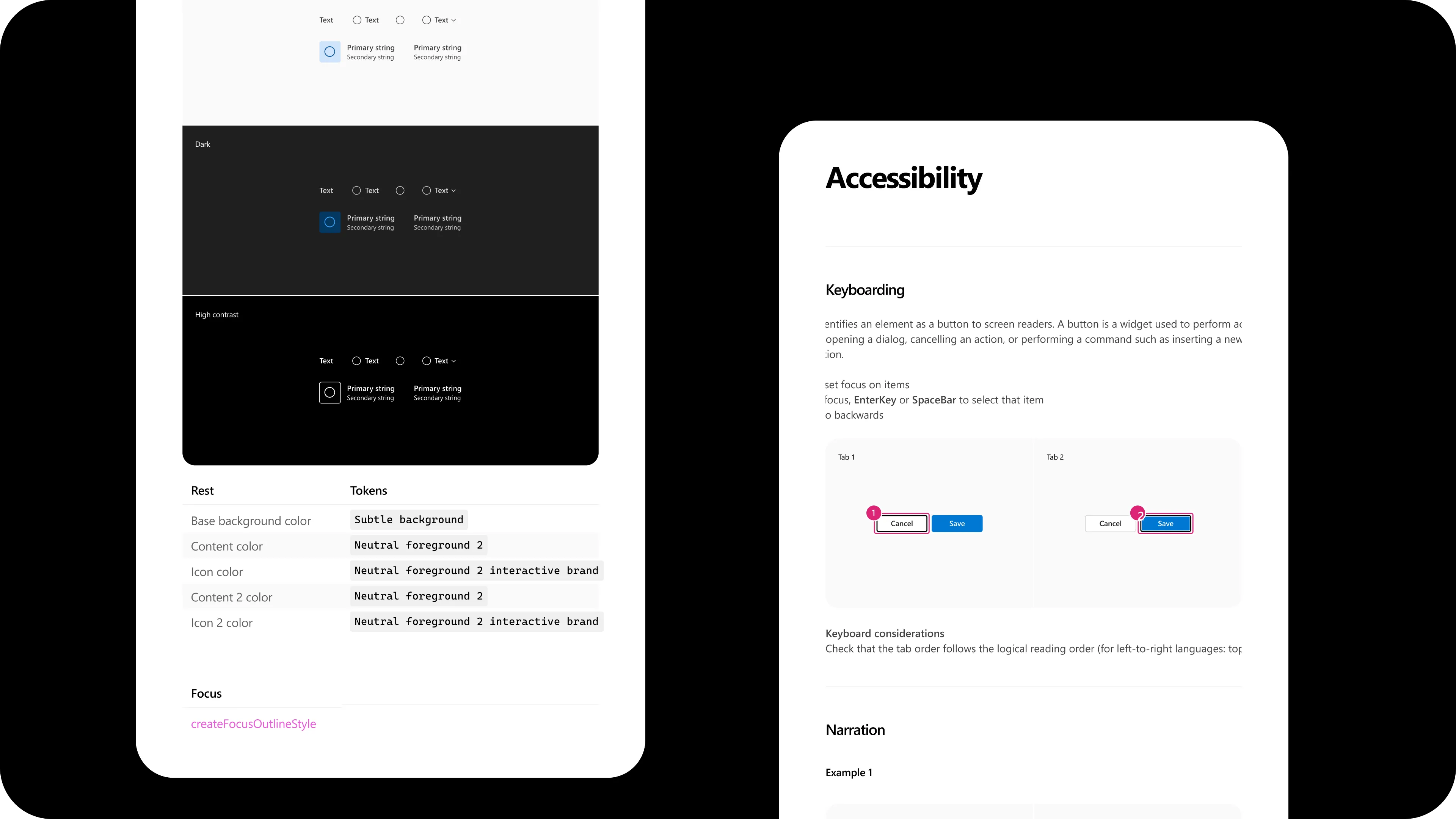
- Design specs in Figma and Word
- Dev documentation in Storybook and code repositories
- Component-specific guidance scattered across the Microsoft writing style guide
- The previous Fluent 1 documentation
- Comments in Figma files and Teams chat threads, for the gaps
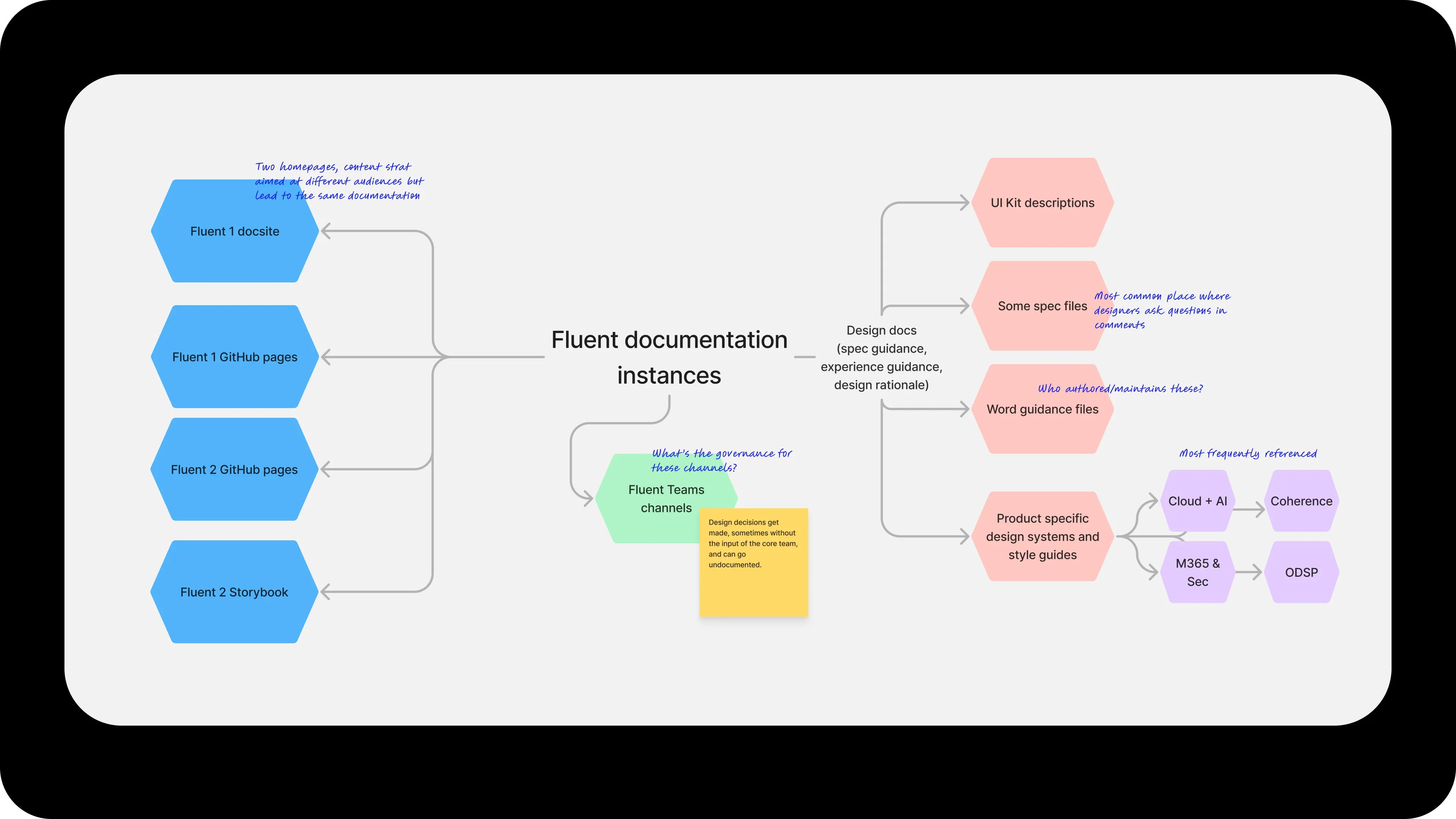
What emerged was a map of the Fluent documentation landscape: which channels were most referenced, who maintained what, where governance was murky, where designers asked questions in comments, and the topology problem of two separate homepages (content strategies aimed at different audiences) both pointing back to the same documentation.
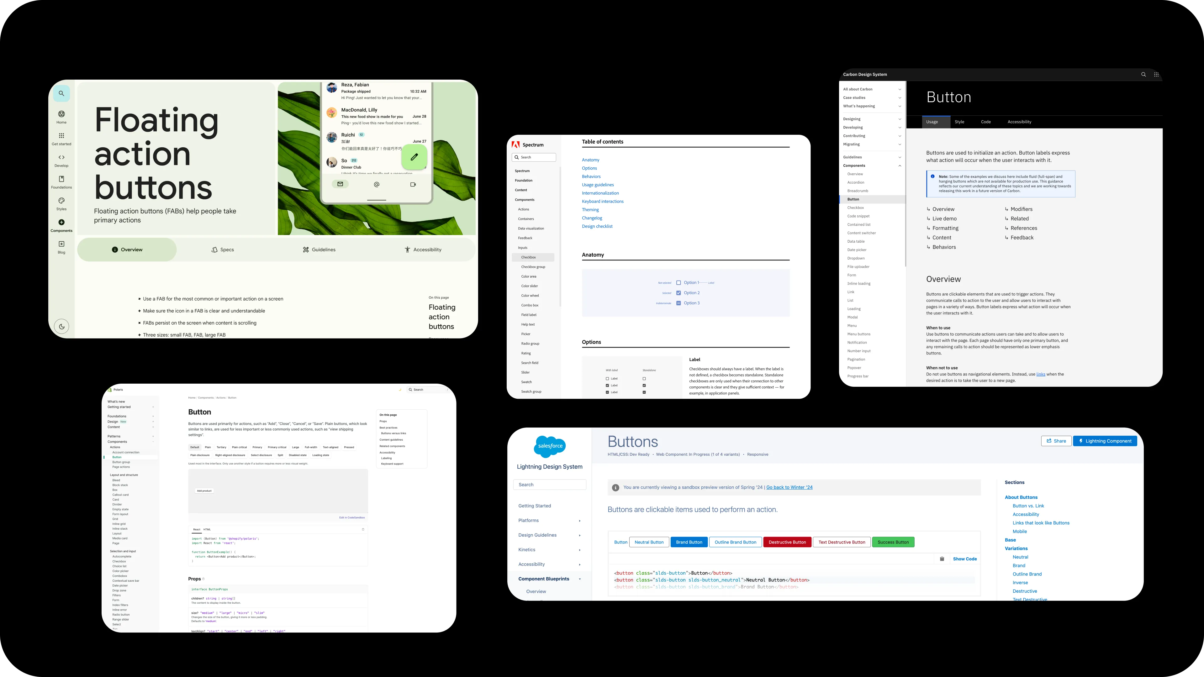
I also looked outward. Industry design systems (Spectrum, Polaris, Lightning, Material) gave me reference points for what a mature component documentation page could be, and where conventions hadn’t yet settled.
Two kinds of content
Before deciding how to structure pages within the docs site, I had to draw the line on what belonged inside the site versus what lived around it.
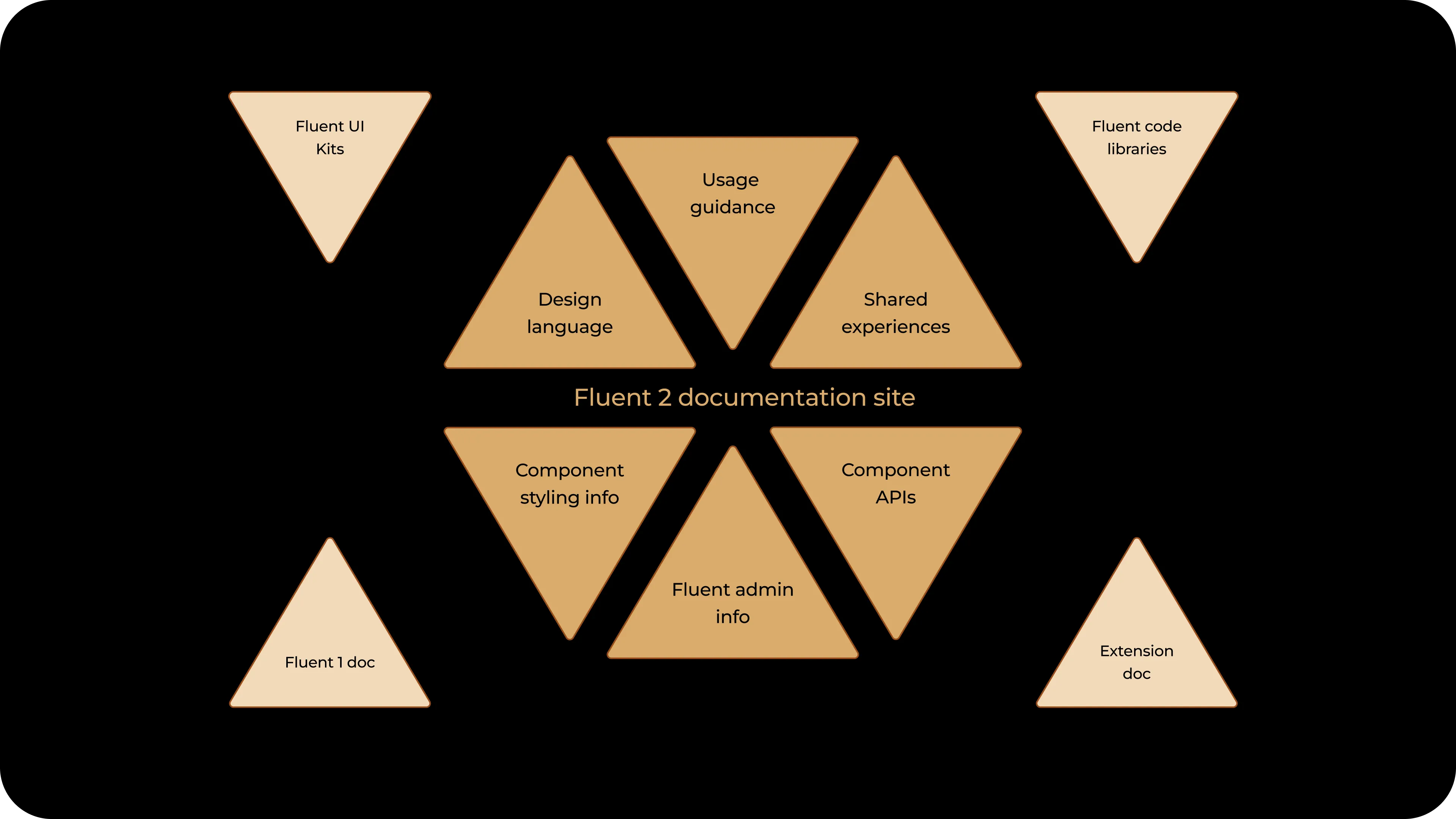
Inside the site, component documentation isn’t one kind of writing. It contains two, and naming the distinction between them is what let the IA settle. The categories differ on audience, phase, and specificity:
| Usage | Specs and APIs | |
|---|---|---|
| What | Information people need to make decisions about a component | Information and options built into the component |
| For whom | Helpful to all makers | Helpful to specific roles |
| When | At all stages of product development | At design phase or implementation phase |
Once that distinction was named, the order followed. Usage guidance goes first because everyone needs it when they’re picking up assets from the system. Specs and APIs are good to reference, but they aren’t choices users get to actually impact at this point in the lifecycle. Most of the structural work was in articulating the difference. The order was a consequence of the analysis.
The IA tree
The component page IA settled into three top-level tabs:
| Usage | Overview (Purpose and When to use), Types, Behavior, Layout, Accessibility, Content |
| Style | Anatomy, Appearance, States, Size, Shape |
| Implementation | API, Code Examples |
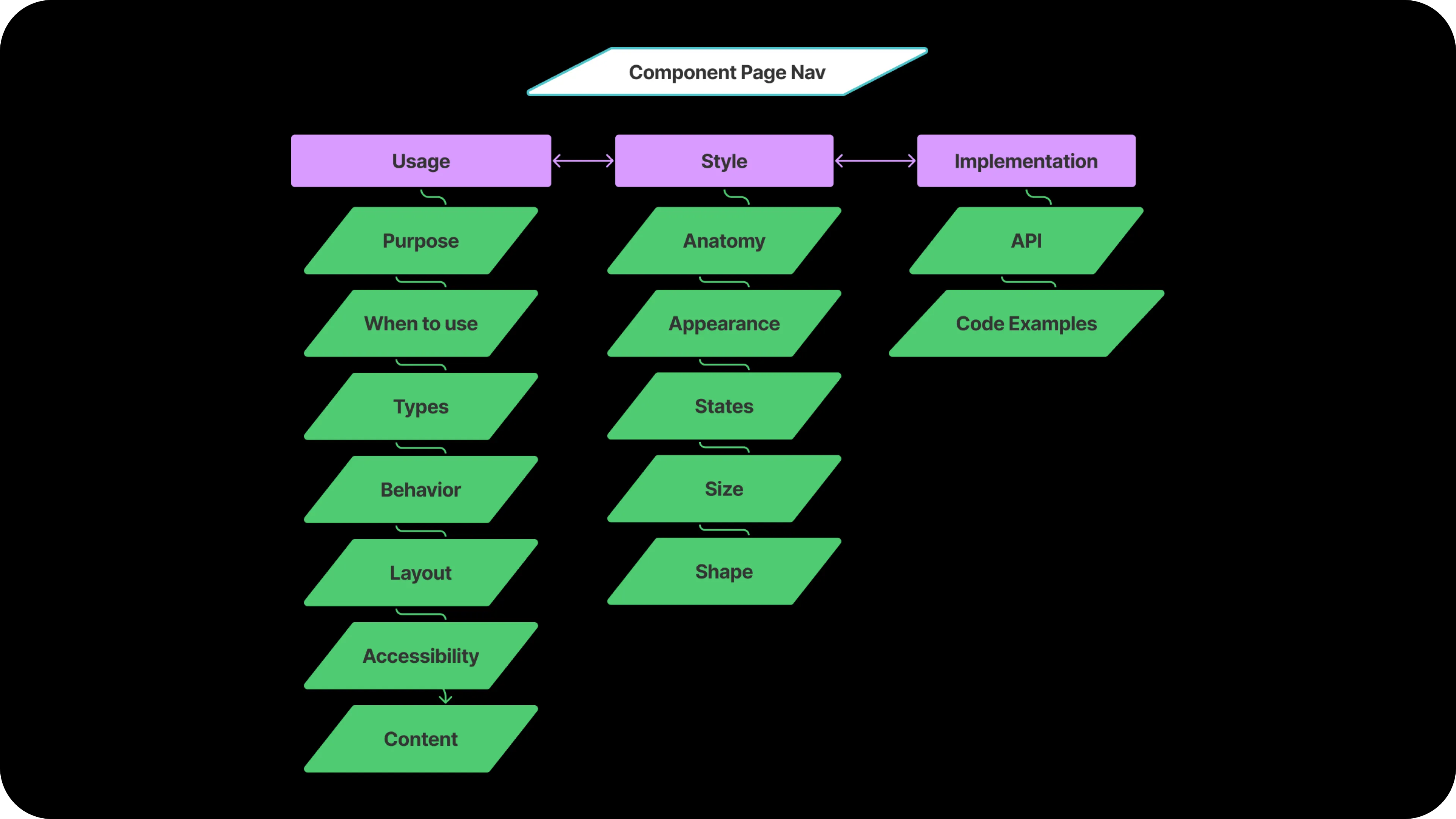
The five-section taxonomy that anchored Usage (Layout, Types, Content, Behavior, Accessibility) became the most-cited shape across the team. It set the contract for what component documentation contained, in what order, with what authoring discipline.
Within the Usage tab
The Usage sub-pages divide into two stages: deciding fit, then applying the solution.
The first stage helps a designer determine whether this component is the right one for their problem:
- Overview answers what the component does, whether it’s a fit, and what alternatives exist
- Types answers whether there are nuances in how to use the component to drive the best UX
- Behavior answers whether the way a user needs to interact with the component matches their goals
Those three help a designer land whether the solution actually fits the problem. If it does, the second stage (Layout, Accessibility, Content) tells them how to apply that solution properly. A designer who hasn’t answered fit doesn’t need the application detail yet.
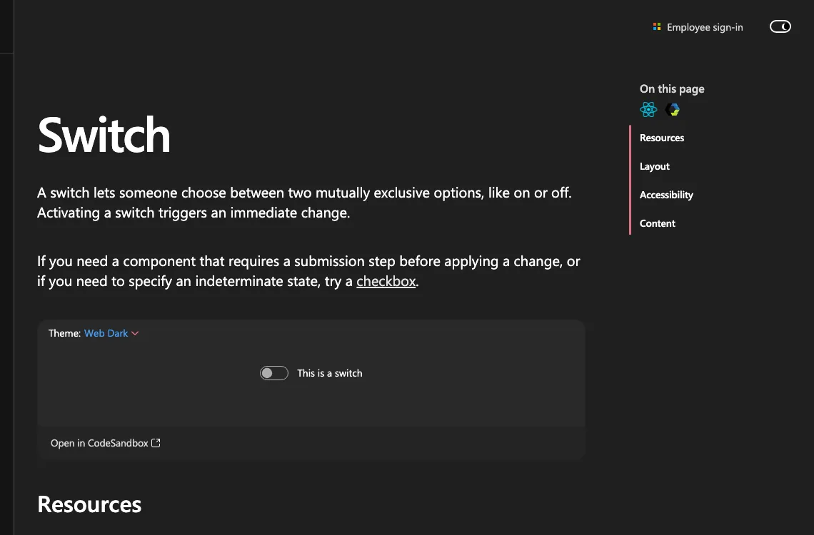
The IA scales with the component. Switch’s Overview names a single alternative (checkbox, for cases that need a submission step or an indeterminate state) and the rest of the page collapses to Layout, Accessibility, and Content because a switch needs little more.
Toast shows the same logic at higher complexity: Overview routes a designer to Dialog, Message Bar, or Field error depending on the stakes. Types and Behavior help them choose between toast variants and timing. Layout, Accessibility, and Content close the application detail.
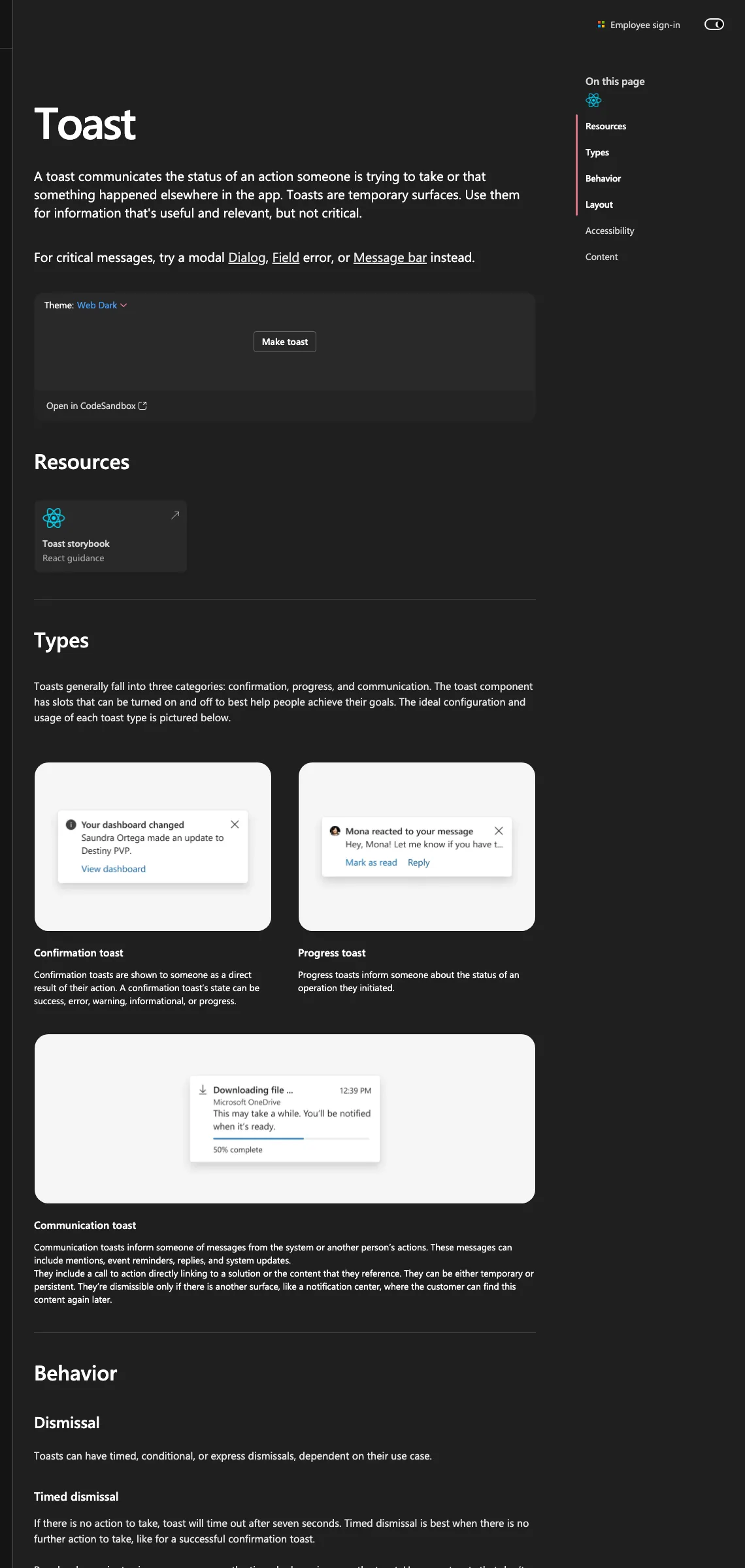
Same shape, different scale. The structure tells a designer where they are in the decision before it tells them how to act.
The style sheet
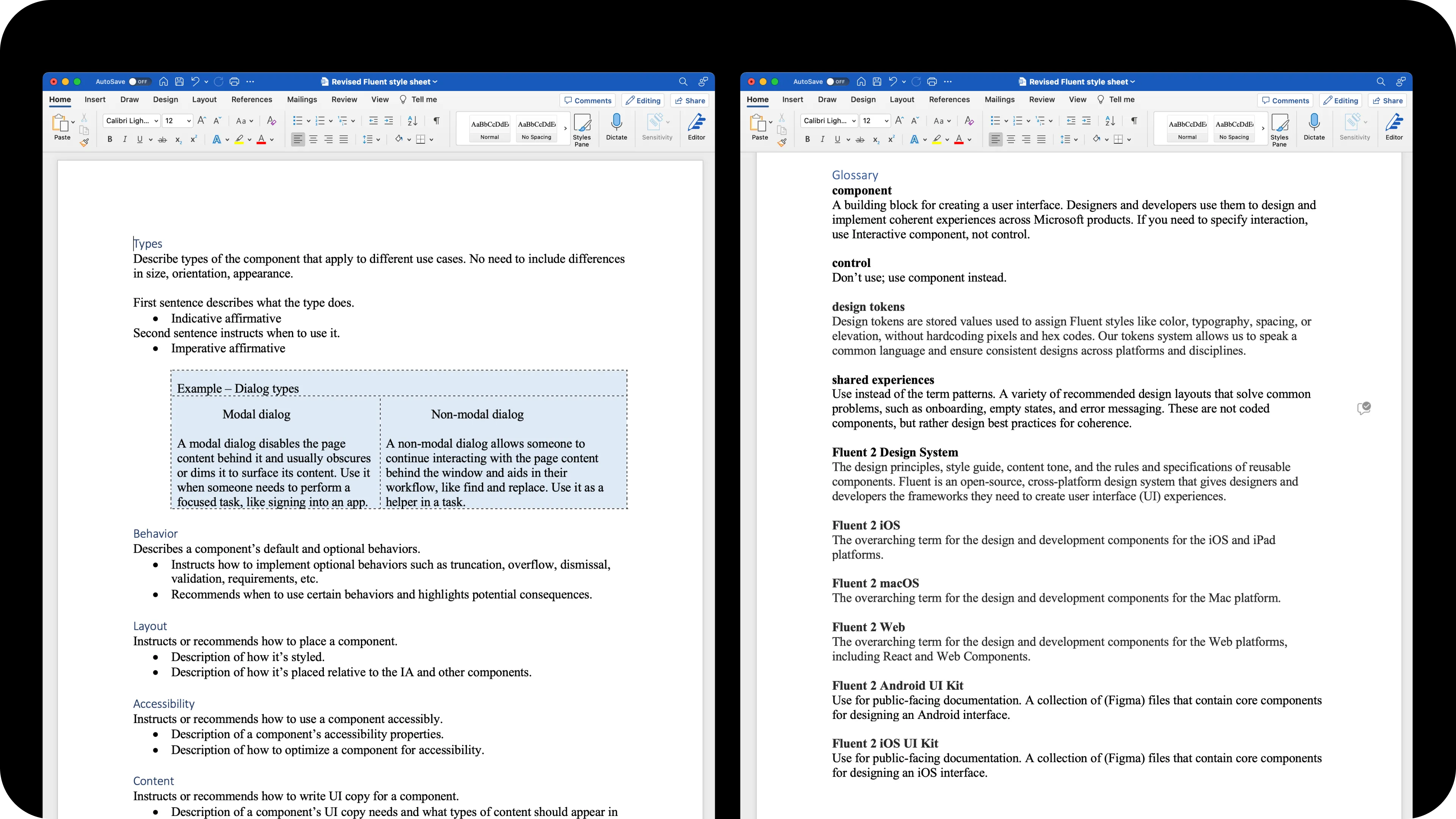
A taxonomy is a goal. To scale it, I authored a paired style sheet: a written authoring guide alongside a Figma component template. Together they made the IA fillable. Slot-style fields. Placeholder authoring instructions. Named sections that matched the IA. Anyone, content designer or not, could pick up the template and produce a structured page.
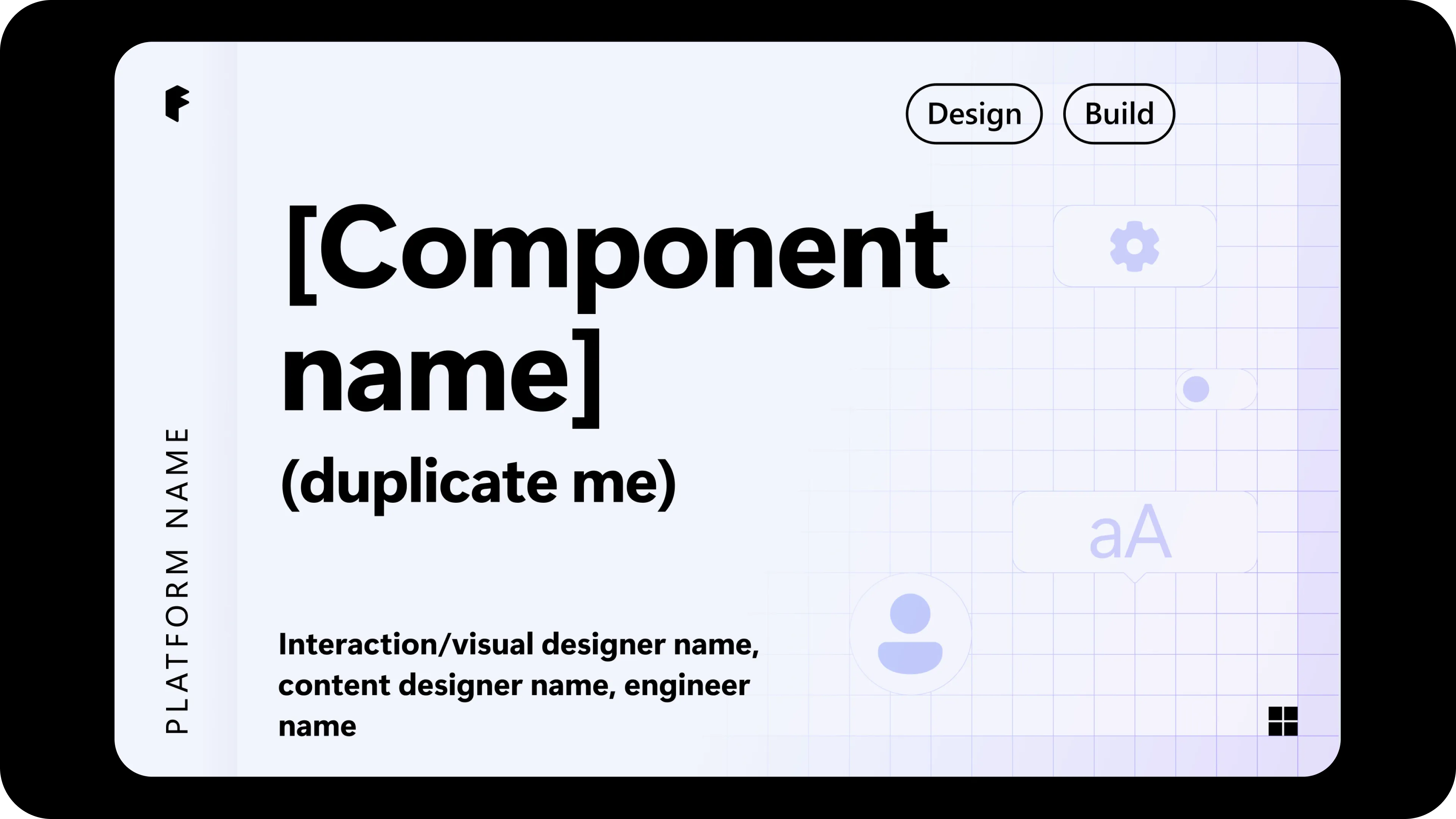
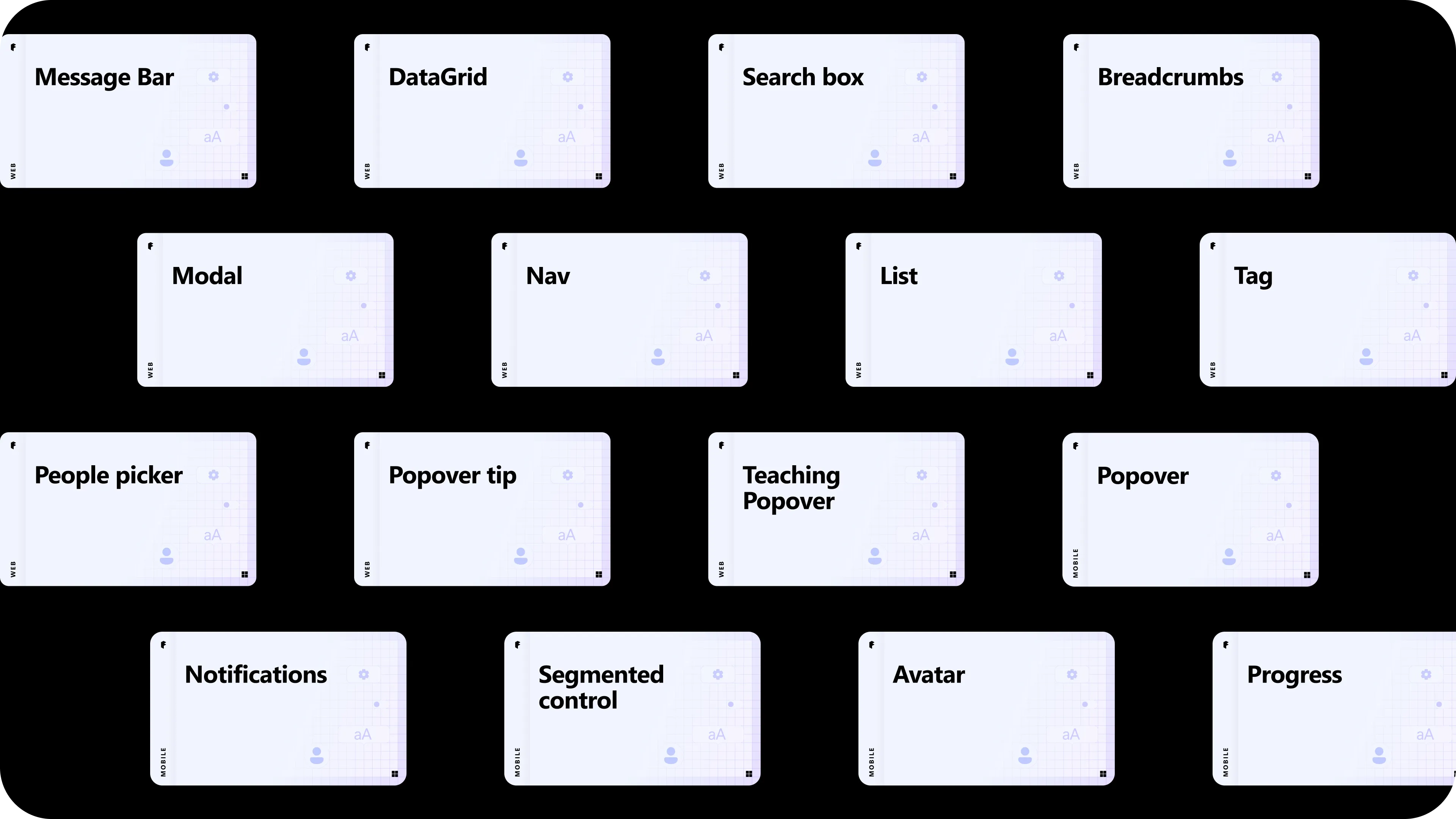
The infrastructure scaled to the whole catalog. I’ve had a hand in every component page on the site, structuring each against the template, with DataGrid, Search box, Breadcrumbs, Message Bar, Nav, Modal, List, Tag, Teaching Popover, People picker, Popover tip, Popover, Notifications, Segmented control, Avatar, and Progress among them, across web and mobile.
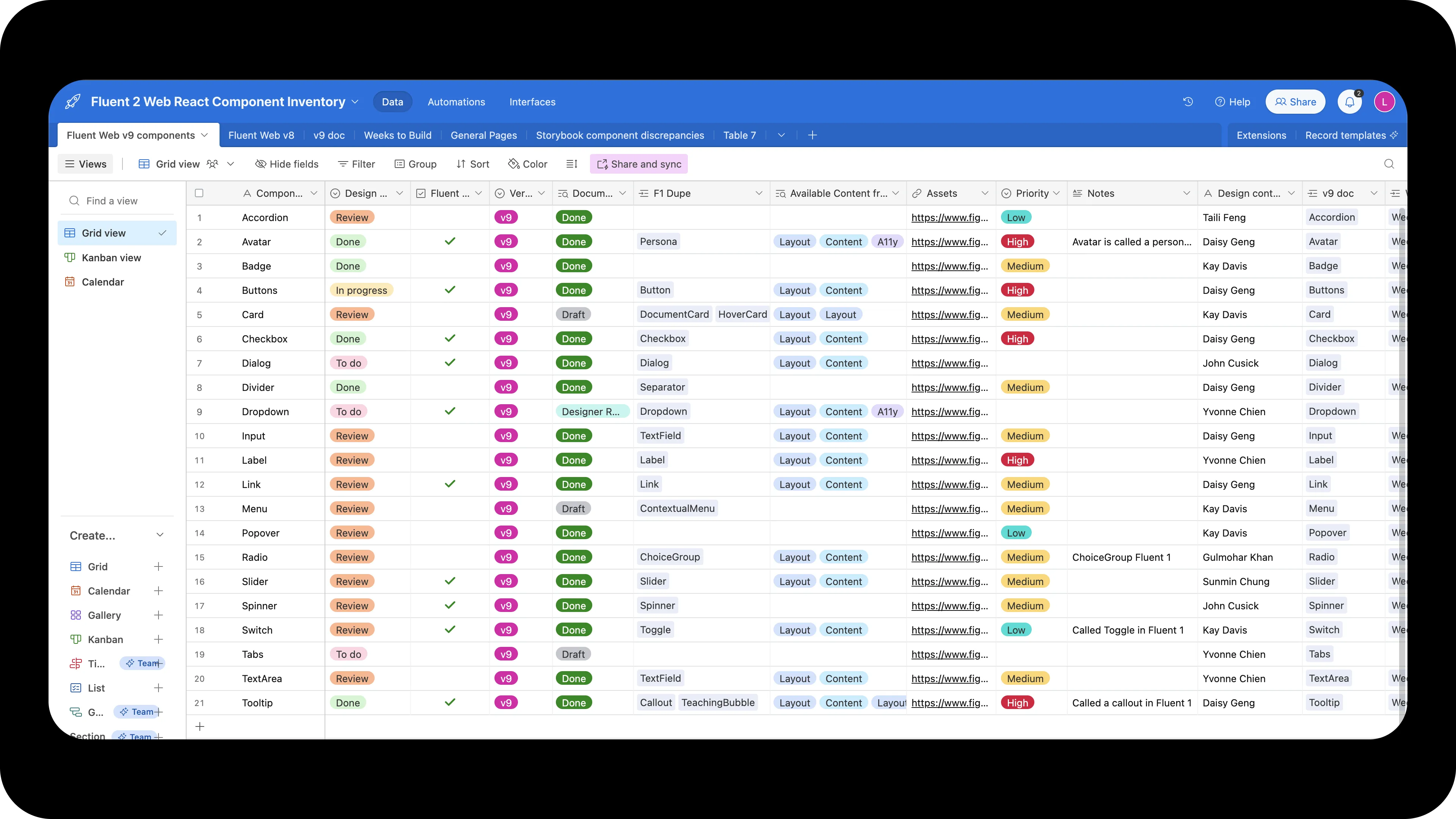
Cross-team coordination at this scale lived in a Figma component inventory I maintained alongside the docs.
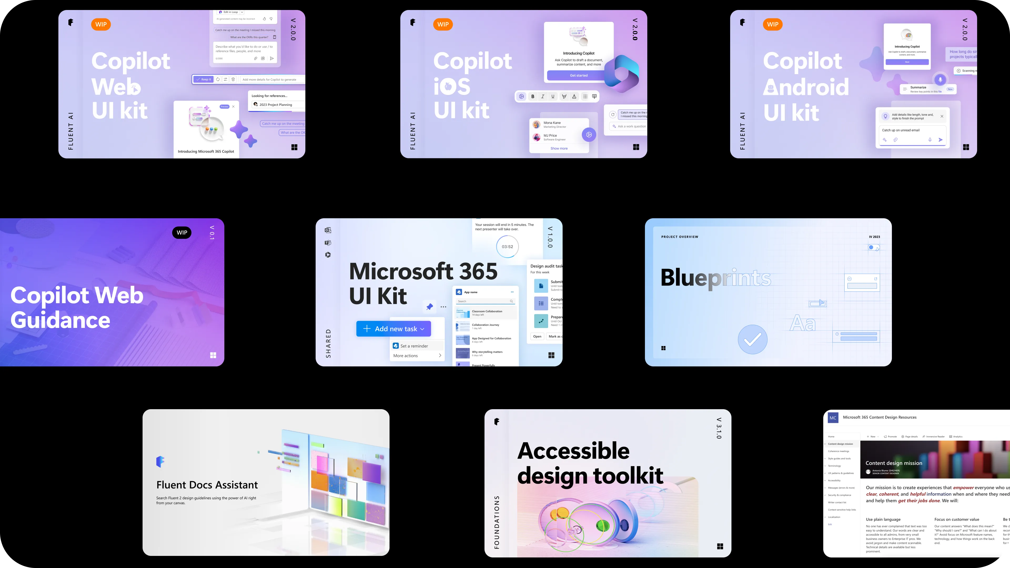
A subsequent attempt to extend the systematization pattern across products, the Blueprints program (Q4 2023), was retired before it scaled. The underlying authoring infrastructure remained in place.
Lineage to AI
The shape of the style sheet (slot-style fields, named sections, fillable placeholders) is the ancestor of the AI-readable schema described in Fluent, Fluently, and of the d11n skill described in And Beyond. Structured content for human authors first. A small re-encoding turned the same structure into something AI can read and write.
The IA work didn’t end at the docs site. It became the foundational pattern for how Fluent now exposes itself to AI tools. Content-design infrastructure for humans first, then for models. Same separations of concerns, different consumers.
Challenges
Lack of resourcing and uneven investment across platforms continues to constrain how fully the model gets implemented. Continued investment and innovative tooling, including the AI-forward extensions described in adjacent case studies, get us closer to the north star.